Learn how to design and create a colorful thumbnail background that captures attention and enhances your content's visual appeal across digital platforms.
Thumbnails are the unsung heroes of online content, acting as mini billboards that capture attention in a crowded digital space. A colorful thumbnail background is the key to making those first impressions count. It's the visual handshake that welcomes viewers, setting the tone and enticing them to explore further. This guide explores the essential elements of creating effective colorful thumbnail backgrounds, from understanding color psychology and composition principles to optimizing for various platforms. We'll also explore how AI-powered tools are revolutionizing thumbnail creation, offering new possibilities for generating unique and engaging visuals. Let's dive into the world of colorful thumbnail backgrounds and discover how they can elevate content and amplify its reach.
Key Takeaways
- Strategic color selection strengthens thumbnails: Color theory and psychology inform effective thumbnail background design. Selecting colors that resonate with an audience and communicate a clear message is crucial for engagement.
- Well-composed thumbnails attract viewers: A strong composition, balanced text and imagery, and appropriate contrast are essential for creating eye-catching thumbnails. Viewers quickly grasp the content's subject with a well-designed thumbnail.
- Platform optimization maximizes impact: Tailoring thumbnail designs to each platform's specifications ensures visibility and effectiveness. Consider each platform's unique requirements for size, aspect ratio, and other elements.
What are Colorful Thumbnail Backgrounds?
Colorful thumbnail backgrounds are the foundation of eye-catching visuals used across digital platforms. Whether for videos, social media posts, or online courses, a well-designed thumbnail background sets the stage for engagement. Think of it as the digital equivalent of a storefront display—it's the first impression that draws viewers in. A great thumbnail background not only complements the subject of the content but also enhances its message, making it more likely to be noticed online.
Definition and Purpose
Thumbnail backgrounds serve a crucial purpose: they provide context and visual appeal. They're the first point of contact between content and a potential viewer. A compelling thumbnail background can significantly influence click-through rates. It's essential to consider elements like composition, contrast, and color psychology to create a thumbnail that effectively communicates a message and grabs attention. Readability is also key—viewers should quickly grasp the content's subject at a glance. Color plays a significant role in evoking emotions and setting the tone. Warm colors, like reds and yellows, can add energy and excitement, while cool colors, like blues and purples, create a calmer atmosphere. Learn more about creating effective thumbnails.
Impact on Branding and Marketing
Beyond attracting clicks, colorful thumbnail backgrounds play a vital role in branding and marketing. Consistent use of color strengthens brand recognition. Think of instantly recognizable brands like Coca-Cola (red) or Facebook (blue)—their consistent color palettes contribute significantly to their memorability. Color can increase brand recognition by up to 80%. This visual consistency aids in recognition and builds trust with an audience. High-quality thumbnails contribute to viewer perception. Incorporating trending colors or seasonal themes can further enhance visibility and appeal to a wider audience.
Thumbnails are mini billboards for online content. They're often the first—and sometimes the only—impression viewers have of a video, product, or article. Color plays a crucial role in grabbing attention and conveying the essence of content.
Color Theory Basics
The foundation of any color-related design work lies in understanding basic color theory. The color wheel provides a visual representation of color relationships, showcasing primary, secondary, and tertiary colors. Think of it as a roadmap for harmonious color combinations. Warm colors (reds, oranges, yellows) tend to evoke energy and excitement, while cool colors (blues, greens, purples) project a calmer, more serene vibe. Knowing these basic principles helps create balanced and visually appealing thumbnails.
Emotional Responses to Different Colors
Color psychology delves into how different colors evoke specific emotional responses. Choosing the right palette can significantly influence how viewers perceive content. Red, for instance, often signifies excitement or urgency, making it a popular choice for sales promotions. Blue, associated with trust and stability, is frequently used by corporate brands. Brand recognition can increase significantly through consistent color use, as seen with iconic brands like Coca-Cola (red) or Facebook (blue). Consider the message to convey and select colors that resonate with the target audience. Using a darker text color on a light background improves readability, while lighter text on a dark background can create a more modern aesthetic. Incorporating trending colors or seasonal themes keeps thumbnails fresh and engaging.
Design Effective Colorful Thumbnail Backgrounds
This section covers core design principles for creating eye-catching and effective colorful thumbnail backgrounds.
Composition Principles
Think of composition as the arrangement of elements within a thumbnail. A well-composed thumbnail guides the viewer's eye to the most important information. Consider the rule of thirds—a classic technique that divides an image into a 3x3 grid. Placing key elements along these lines or at their intersections creates a natural focal point. Leading lines, like roads or pathways in an image, can also draw the viewer's eye toward a specific point. A clear focal point helps viewers quickly grasp the content's subject. Choosing the right colors, fonts, and design elements is also essential for compelling thumbnails.
Contrast and Readability
Contrast is crucial for a thumbnail to stand out, especially among other content. It ensures text and other elements are easily discernible against the background. Using a dark text color on a light background, or vice versa, enhances readability. A darker background with lighter text can create a sophisticated look. Consider the color wheel and choose opposite colors for maximum contrast. Maintain consistent branding by using the same brand fonts, elements, and color schemes in every thumbnail. This reinforces brand recognition and creates a cohesive online presence.
Balancing Text and Imagery
Finding the right balance between text and imagery is key for effective thumbnail design. Too much text can clutter a thumbnail, making it difficult to read at a glance. Too much imagery without clear text can leave viewers unsure of the content. A good rule of thumb is to use minimal text while still conveying the core message. Prioritize clear, concise text that's easy to read at small sizes. Contrasting colors make key elements pop, and negative space (empty areas around the main subject) prevents a thumbnail from feeling overcrowded. Avoid overcrowding with too many elements. Focus on a few key visuals and text elements for a clean, impactful design. Thumbnails are often the first impression of content, so make it count.
Where to Find Colorful Thumbnail Backgrounds
Sourcing the perfect background for thumbnails is easier than you think. Whether you're working with a budget or need something unique, several avenues are worth exploring.
Stock Image Platforms
Sites like Adobe Stock offer extensive libraries of royalty-free images, vectors, and videos. With thousands of options specifically tagged for “thumbnail background,” finding vibrant and diverse choices for any project is straightforward. Many other stock image sites offer similar resources, so explore different platforms to find the best fit.
Free Design Resources
If budget is a concern, free design resources like Unsplash offer collections of high-quality thumbnail backgrounds. These images are often free for commercial use and don’t require attribution, making them a convenient option for quick projects. Always check the specific license agreements for each image.
Custom Design Services
For projects that demand a unique touch, consider working with freelance designers or design agencies. Custom design ensures thumbnail backgrounds align perfectly with brand identity and stand out from the competition. Platforms like Dribbble and Behance offer access to talented designers specializing in various styles. This option typically involves a higher investment but guarantees originality and a tailored design.
Create Custom Colorful Thumbnail Backgrounds
This section explores several methods for creating custom colorful thumbnail backgrounds, from traditional design software to AI-powered tools. Choosing the right method depends on design skills and the level of customization needed.
Design Software Options
Software like Canva and Photoshop offer different approaches to background creation. Canva provides an intuitive interface with pre-made templates and design elements, making it ideal for beginners. Its drag-and-drop functionality simplifies design, allowing anyone to create visually appealing backgrounds. Photoshop offers more advanced features for detailed editing and image manipulation, giving experienced designers greater control. Consider which software best suits skill level and desired outcome.
Online Background Generators
Online background generators offer a quick and easy way to create colorful backgrounds without professional design software. Tools like Snappa provide various customizable templates and background options, streamlining design. These platforms often cater to specific design needs, such as social media graphics, making it simple to create platform-appropriate thumbnails.
AI-Powered Design Tools
AI is transforming design, offering powerful tools for generating unique and vibrant backgrounds. These tools use text prompts or image inputs to create custom designs, often in seconds.
Recraft
Recraft's AI-powered design platform offers a suite of tools for creating stunning visuals.
Recraft V3 supports unique capabilities vital for graphic design space. The distinctive feature of Recraft is that it supports vector image generation, ranging from sets of simplistic pictograms all the way to highly detailed vector art. Recraft provides a whole suite of AI image editing tools that helps designers create and edit visuals end-to-end: AI Eraser, Modify Area, Inpainting, Outpainting, AI Mockuper, Creative and Crisps Upscalers, AI Fine-Tuning, and Background Remover.
Optimize Colorful Thumbnails for Different Platforms
Creating a stunning thumbnail is only half the battle. Optimizing it for its intended platform is the other. Each platform has unique specifications, and understanding these nuances is key to maximizing visibility and impact.
Social Media Specifications
Social media platforms are dynamic. What works on Instagram might not work on Facebook or Pinterest. Consider these factors when designing thumbnails for social media:
- Size and aspect ratio: Each platform has ideal thumbnail dimensions. Sticking to these ensures the entire thumbnail displays correctly. Refer to each platform's guidelines for the most up-to-date specifications.
- Color psychology: Incorporating trending colors or seasonal themes can increase visibility and appeal to a broader audience. Articles like this one on choosing colors for YouTube thumbnails offer insights into color psychology.
- Mobile optimization: Most social media users access platforms on mobile devices. Ensure thumbnails are easily viewable on smaller screens.
Video Hosting Sites Requirements
Video hosting sites like YouTube and Vimeo rely heavily on thumbnails to attract viewers. Here’s what to keep in mind:
- High resolution: High-quality images are crucial for attracting clicks. Blurry thumbnails appear unprofessional and can deter viewers.
- Emotional tone: Experimenting with different emotional tones can significantly impact viewer engagement.
- Clear title and branding: Incorporate the video title or key message directly onto the thumbnail to provide context. Consistent branding also helps viewers quickly identify content.
E-commerce Platform Guidelines
Thumbnails play a vital role in e-commerce, influencing purchasing decisions. Consider these platform-specific guidelines:
- Product focus: Thumbnails should clearly showcase the product. High-quality images that highlight key features and benefits are essential.
- Background and lighting: Use a clean background to ensure the product stands out. Proper lighting enhances the product’s appearance.
- AI-generated imagery: AI-generated thumbnails on e-commerce platforms have shown promising results. Tools like Recraft can help create professional thumbnails.
Measure and Improve Thumbnail Performance
Attracting viewers to online content relies heavily on eye-catching visuals. Thumbnails serve as a first impression, influencing whether someone clicks a video, reads an article, or explores a product. Measuring and improving thumbnail performance is crucial for maximizing audience engagement.
Key Performance Indicators
Visually appealing thumbnails increase clicks and drive engagement. Their effectiveness is measurable through key performance indicators (KPIs). Click-through rate (CTR) measures how often people click a thumbnail after viewing it. A high CTR indicates a successful thumbnail, enticing viewers to learn more. Watch time, the total time spent watching content, reflects engagement after the initial click. Audience retention, the percentage of viewers who continue watching, further reveals how well the content holds interest. Tracking these KPIs provides valuable insights into thumbnail effectiveness.
A/B Testing Strategies
A/B testing helps determine which thumbnail designs resonate with an audience. This method involves creating two versions of a thumbnail and showing each to a segment of the audience. Comparing CTRs identifies the better-performing design. Experiment with different styles, colors, and messaging to optimize performance. For instance, an experiment showed that a thumbnail with a negative tone achieved a 37.1% higher CTR than its positive counterpart, highlighting the impact of testing various approaches.
Analytics Tools for Thumbnail Performance
Analytics tools are essential for analyzing thumbnail performance. These tools track metrics like CTR and viewer engagement, providing data-driven insights for refining designs. YouTube Analytics, for example, offers comprehensive data on thumbnail performance. Measuring performance allows creators to make informed decisions to enhance viewer attraction and retention. SG Analytics provides further information on analyzing YouTube thumbnail performance. Recraft's API allows developers to integrate its image generation capabilities into applications, streamlining thumbnail creation and testing.
Thumbnail Best Practices and Common Mistakes
Well-designed thumbnails are crucial for grabbing attention and driving clicks. Here’s how to make sure colorful thumbnail backgrounds contribute to overall success.
Consistency with Brand Identity
Think of thumbnails as mini-billboards for content. Maintaining a consistent brand identity across all platforms helps viewers instantly recognize your work. This means using the same fonts, color palettes, and design elements in every thumbnail. If brand guidelines specify a particular shade of blue, incorporate that blue into thumbnail backgrounds. This consistency strengthens brand recognition and builds a cohesive online presence. Viewers will begin to associate those visual cues with the content, making it easier for them to find and engage with your work.
Accessibility Considerations
Accessibility is often overlooked in thumbnail design, but it's essential for reaching the widest possible audience. One key aspect is ensuring sufficient contrast between the text and background. Light-colored font on a light background, or vice versa, can make text difficult to read. Opt for high contrast to improve readability. Clear fonts are also important. Avoid overly stylized or decorative fonts that might be difficult to decipher. Prioritizing accessibility ensures that everyone can engage with the content.
Avoiding Design Pitfalls
One of the most common thumbnail design mistakes is overcrowding the thumbnail with too many elements. A cluttered thumbnail can overwhelm viewers and obscure the content's message. Keep it clean and focused. Select a few key elements, like a compelling image and a short, impactful title, to convey the essence of the content. Another frequent mistake is neglecting visual hierarchy. Varying the size and placement of elements creates a clear focal point and guides the viewer's eye. Thumbmachine offers helpful advice on creating effective visual hierarchy. Avoid using similar-sized images and text, which can result in a flat, unengaging design. Instead, create a clear distinction between the most important elements and supporting details.
What's Next for Colorful Thumbnail Backgrounds?
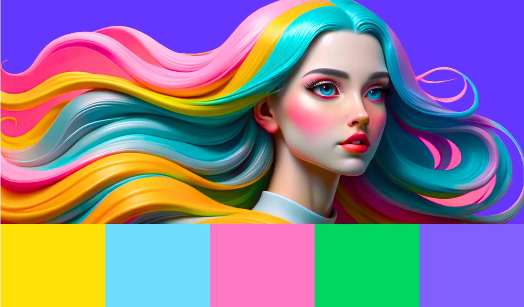
Trends in graphic design are constantly evolving. Thumbnail backgrounds are no exception. One emerging style uses vibrant, often unexpected color combinations to grab attention. Think neon gradients paired with deep jewel tones, or pastel palettes accented with bold, contrasting hues. This approach creates dynamism and helps a thumbnail stand out in a crowded feed. As viewers scroll through content, eye-catching color palettes can stop their thumbs and encourage clicks. Another trend incorporates colors to evoke specific emotions or create a particular atmosphere. Warm colors, like reds and yellows, add energy and excitement, while cool colors, like blues and purples, create a calming vibe. Consider the message a thumbnail needs to convey and choose colors accordingly. Incorporating trending colors or seasonal themes into thumbnails can increase visibility and appeal to a broader audience.
Technological Advancements in Thumbnail Creation
Artificial intelligence is rapidly changing the design landscape, including thumbnail creation. AI-powered tools like Recraft offer sophisticated features that streamline design. Recraft's AI Image Generator allows users to create custom thumbnail backgrounds from text prompts, offering a new level of customization and control. These AI-generated thumbnails are tailored to attract user attention, leading to higher click-through rates. This data-driven approach has proven effective in increasing click-through rates and retaining users on platforms. Beyond AI image generation, tools like Recraft’s Background Remover and Image Upscaler simplify creating polished, professional thumbnails. These advancements empower creators to produce high-quality visuals quickly, even without extensive design experience.
Tools for Colorful Thumbnail Creation
Attracting viewers to your content starts with a compelling thumbnail image. A range of tools makes it easy to create eye-catching backgrounds, even without advanced design skills. Let's explore some options, from traditional graphic design software to AI-powered solutions.
Frequently Asked Questions
Why are colorful thumbnail backgrounds important? They're the first thing people see. A great thumbnail background grabs attention and entices viewers to click, whether it's for a video, social media post, or online course. It's like a storefront display—it needs to be attractive and relevant to draw people in.
How do I choose the right colors for my thumbnail backgrounds? Consider your content and target audience. Warm colors like reds and oranges evoke energy, while cool colors like blues and greens suggest calmness. Color psychology plays a big role, so research which colors resonate with the message you want to convey. Also, ensure good contrast between the background and any text or other elements for readability.
Where can I find high-quality thumbnail backgrounds? Several options exist, depending on your budget and needs. Stock image platforms like Adobe Stock offer a vast library of royalty-free images. Free resources like Unsplash provide high-quality images free for commercial use. For a unique look, consider custom design services from freelance designers or agencies. AI tools like Recraft also offer a quick and easy way to generate custom backgrounds.
What are some common mistakes to avoid when designing thumbnails? Overcrowding a thumbnail with too many elements is a common pitfall. Keep it clean and focused with a few key visuals and text. Another mistake is neglecting visual hierarchy. Varying the size and placement of elements creates a clear focal point and guides the viewer's eye. Also, ensure the thumbnail aligns with brand identity for consistency.
How can I stay up-to-date with the latest thumbnail design trends? Keep an eye on design blogs, social media, and online design communities. Pay attention to what other creators are doing, especially those in your niche. Experiment with different styles and colors to see what resonates with your audience. AI-powered design tools are constantly evolving, so explore new features and functionalities as they become available. Remember, trends change, but the principles of good design remain constant.